Gazelle Creature Mark.
spring 2025


Phase 1
Project Objective.
I aimed to create a graphic interpretation of a Thomson’s Gazelle, using a clear and organized approach to visual communication.
The final design is meant to capture the key traits that make this creature distinctive.
The final design is meant to capture the key traits that make this creature distinctive.

Research.
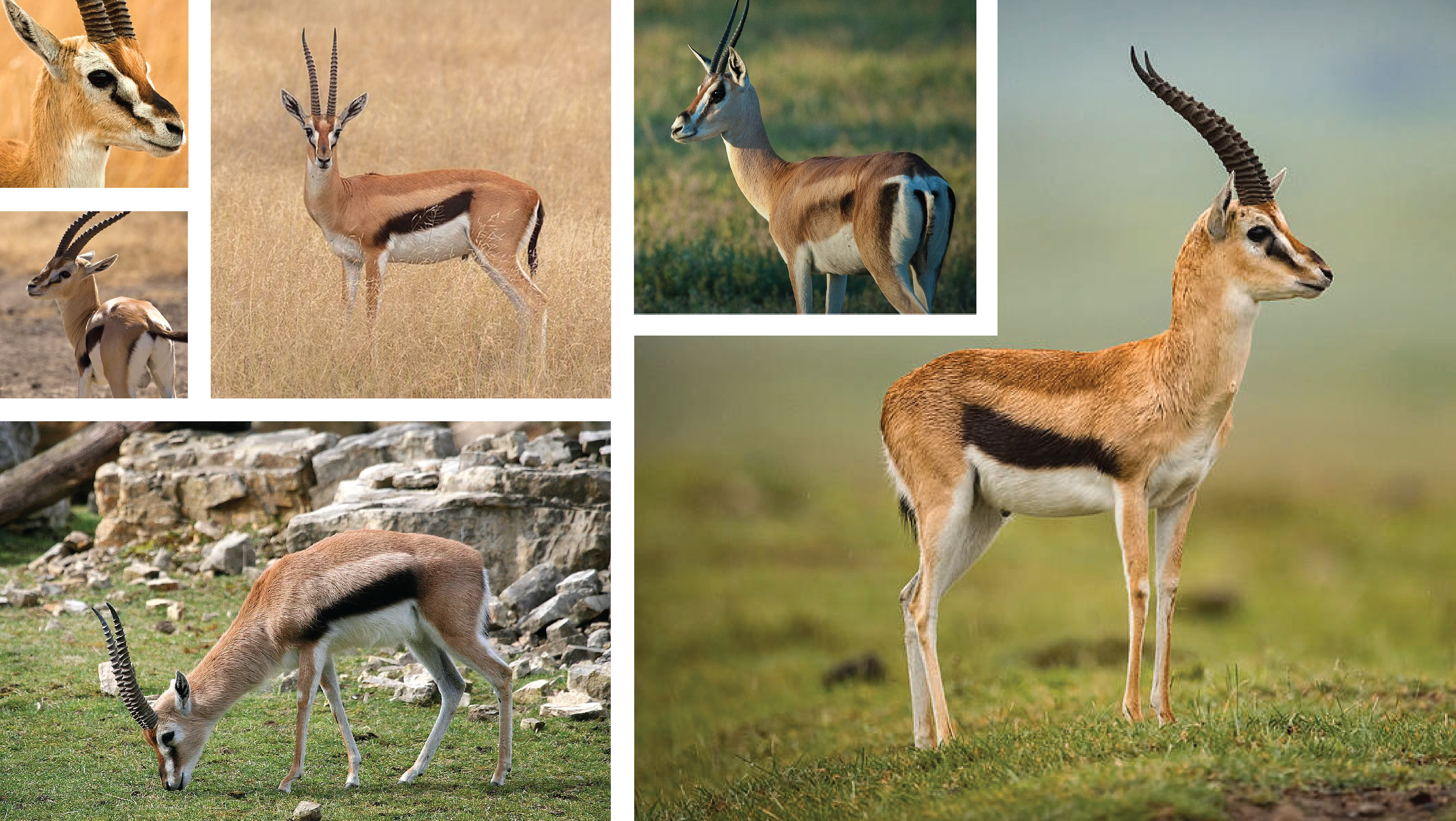
It is important to identify the gazelle's most distinctive physical features and the behaviors associated with them. Below are some Gazelle photos I referenced to highlight these defining traits. The key features that stood out include the gazelle's slender build, which contributes to its agility and ability to evade predators. I aim to express these characteristics through fluid yet sharp line work.

Essential Physical Characteristics.
Ringed Horns
Black stripes on the eye and body
Long legs
Slender
Curved tail
Potential Associative Characteristics.
Cautious
Agile
Graceful
Majestic
Swift

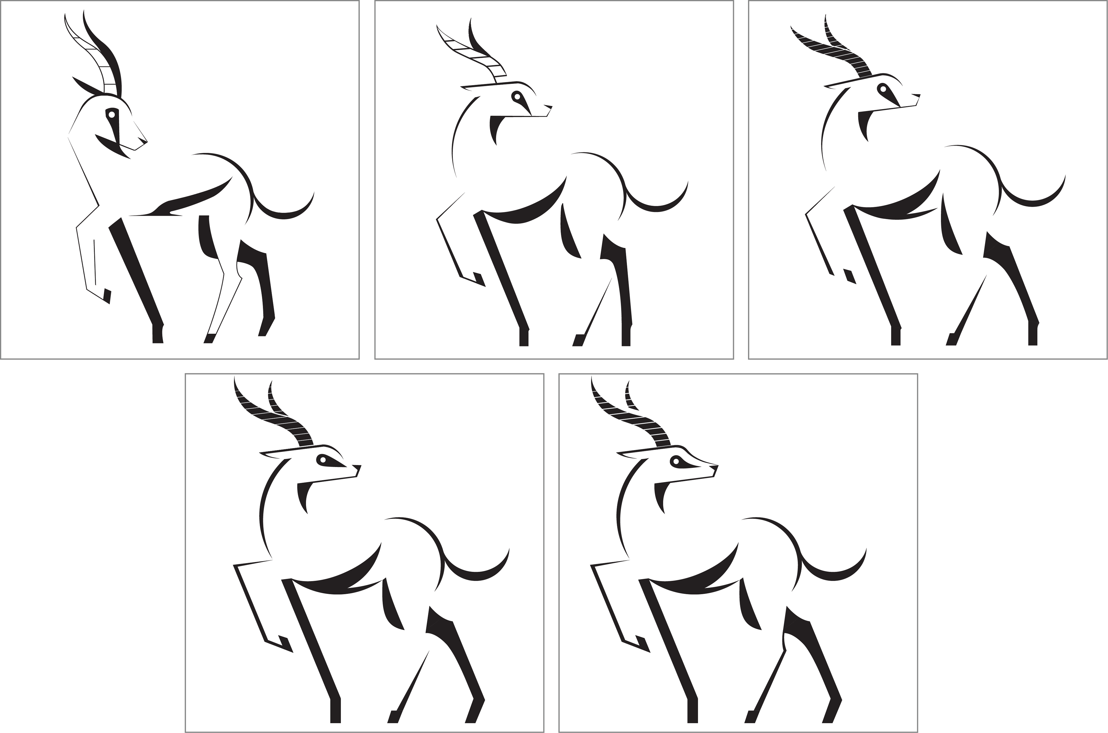
Rough Sketches.
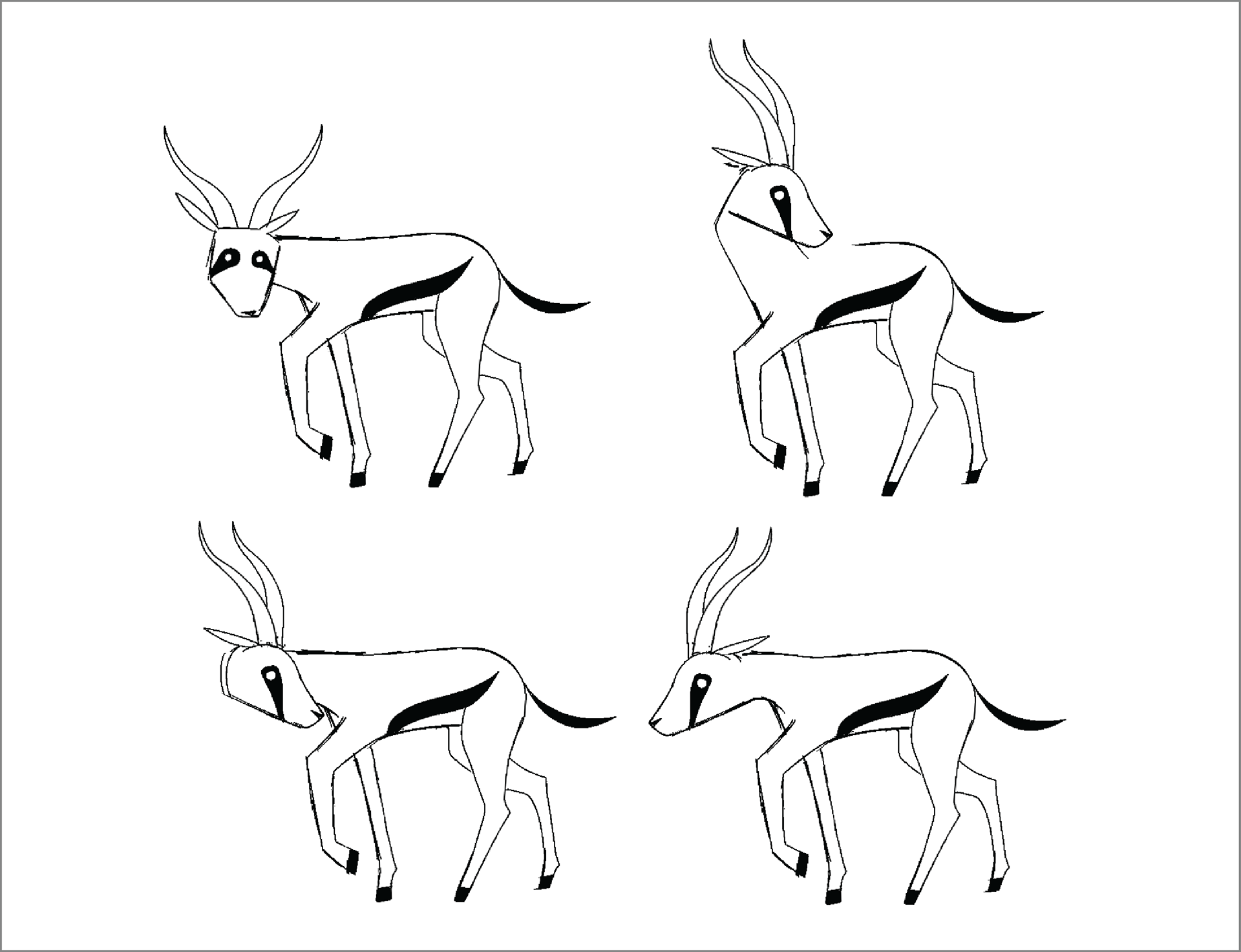
When working on the sketches, I avoided drawing the gazelle realistically. Instead, I challenged myself to sketch it quickly to identify the essential features of its form. The sketches above are iterations of this process.

Digital Translation.
After the rough sketches, I had a specific pose in mind that I maintained throughout the digital refinement process. The first digital ideation closely resembles my initial sketches, but I deviated from it in the subsequent iterations.

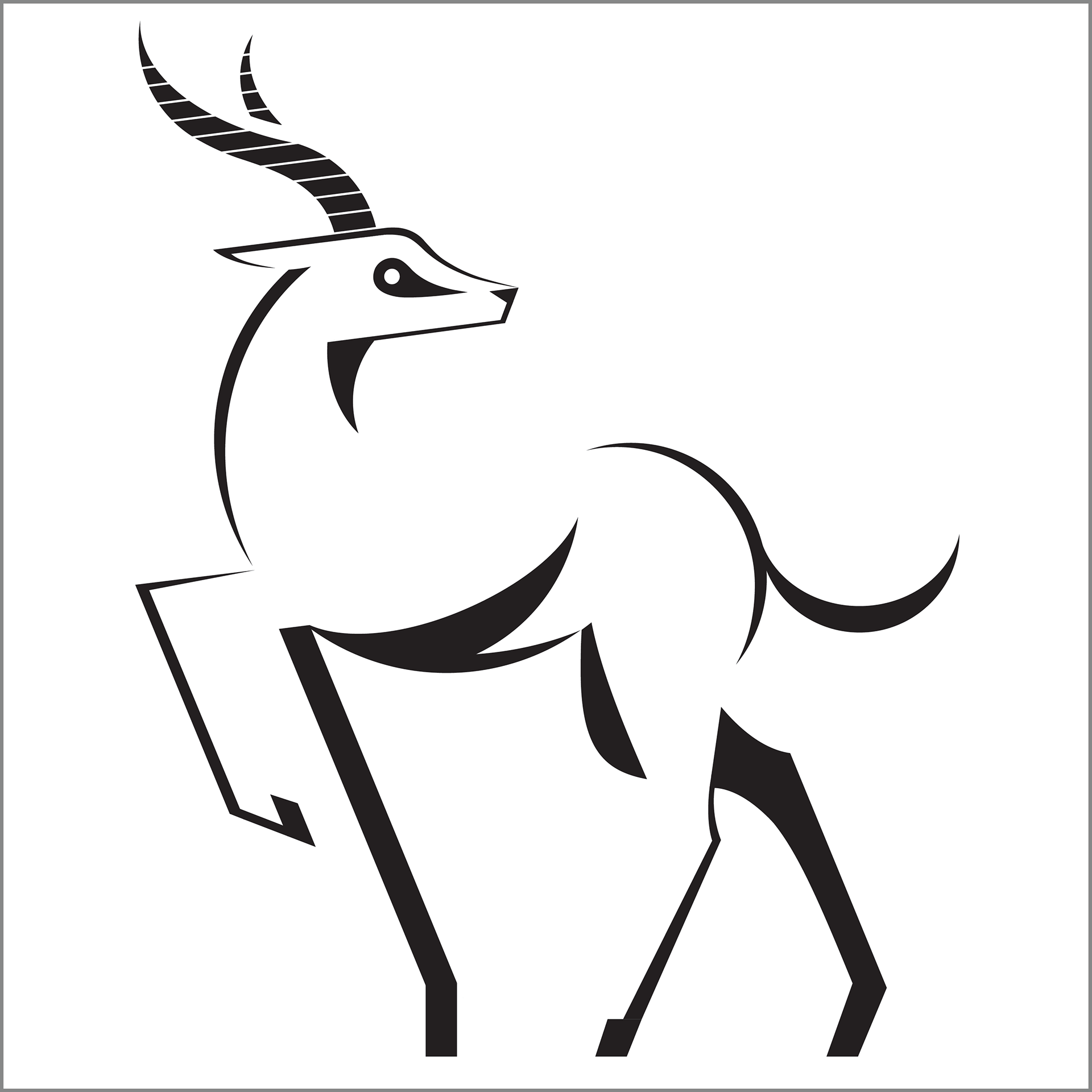
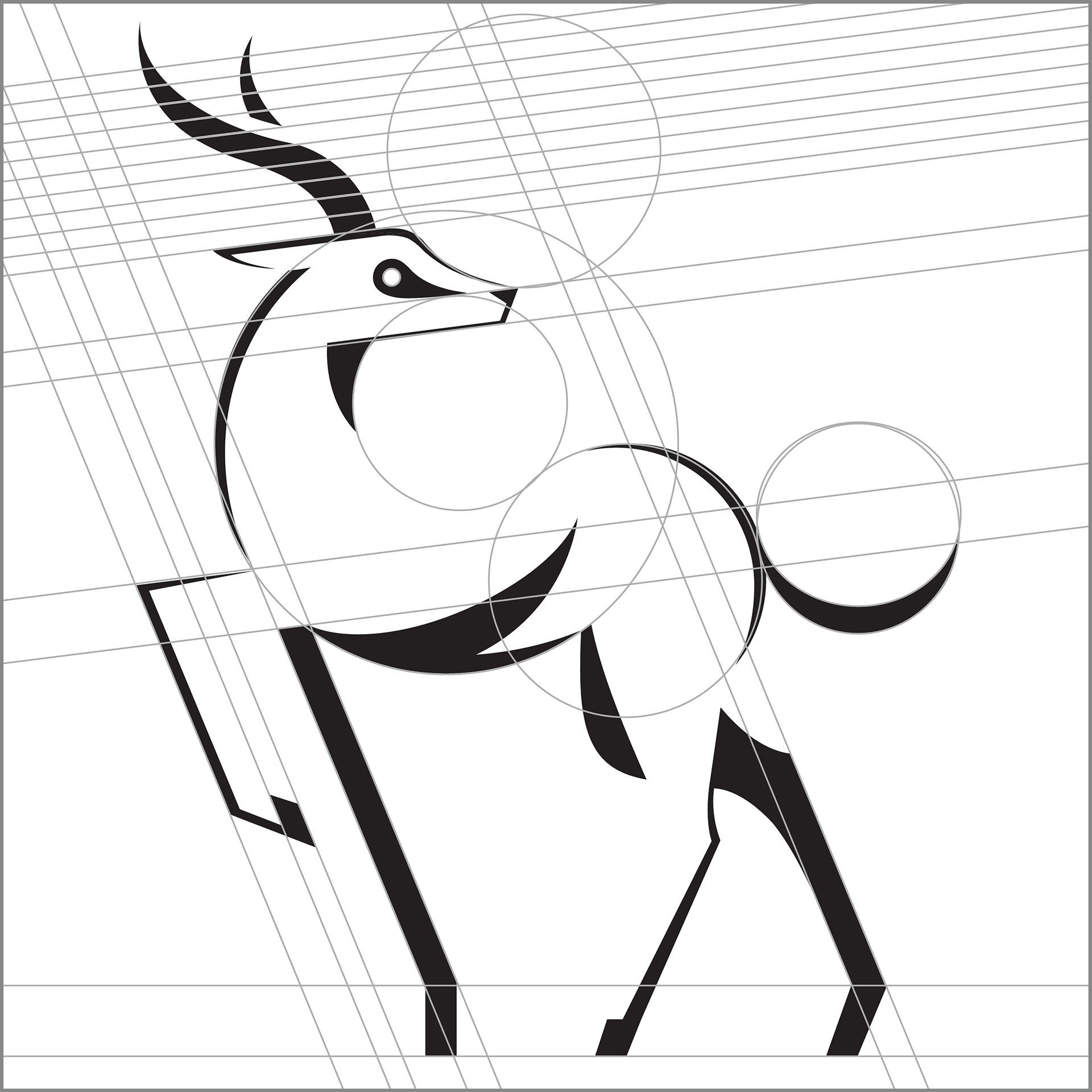
Final Mark.
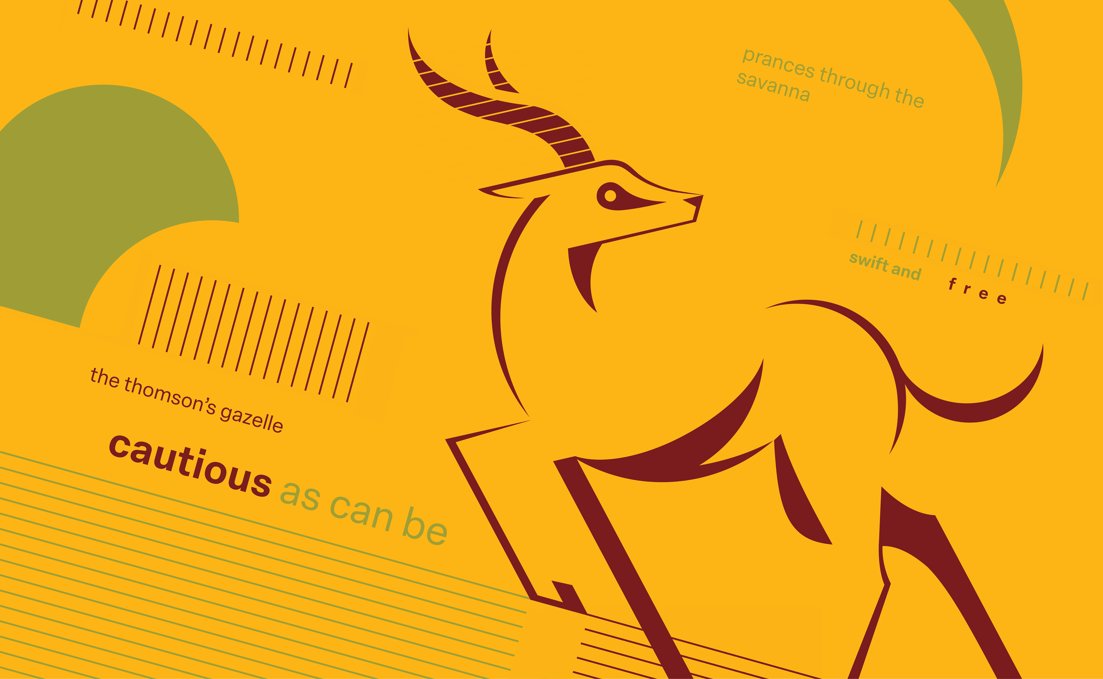
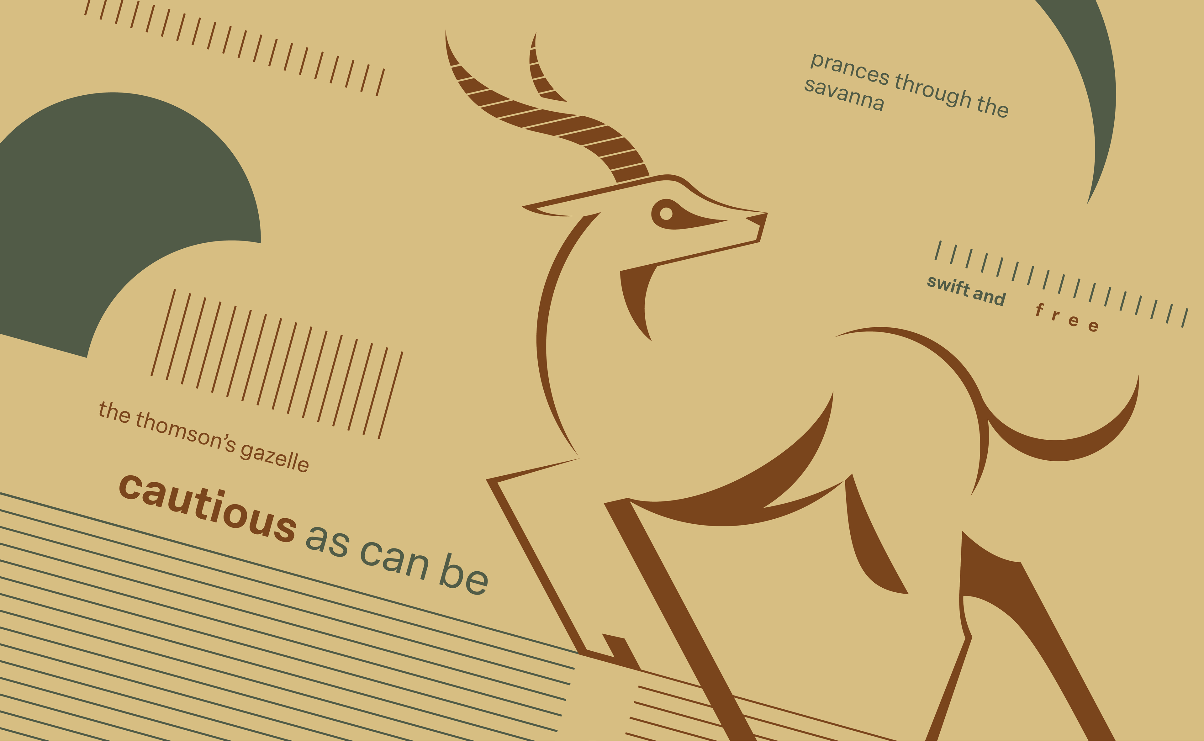
The balance of curves and sharp edges helps emphasize the grace and majesty of the gazelle, while also conveying their impressive speed. Gazelles are naturally cautious, often on the lookout for potential threats. So the gazelle is turning its head as if checking behind itself.

Phase 2
Composition + Typography.
Integrate a short typographic phrase into the composition alongside the creature mark. The design should use a similar kit of parts to ensure coherence between the elements, while also maintaining a consistent axial framework. Additionally, color will be incorporated in this phase.
Interpretive Phrase.
"The Thomson's gazelle, cautious as can be, prances through the savanna, swift and free."
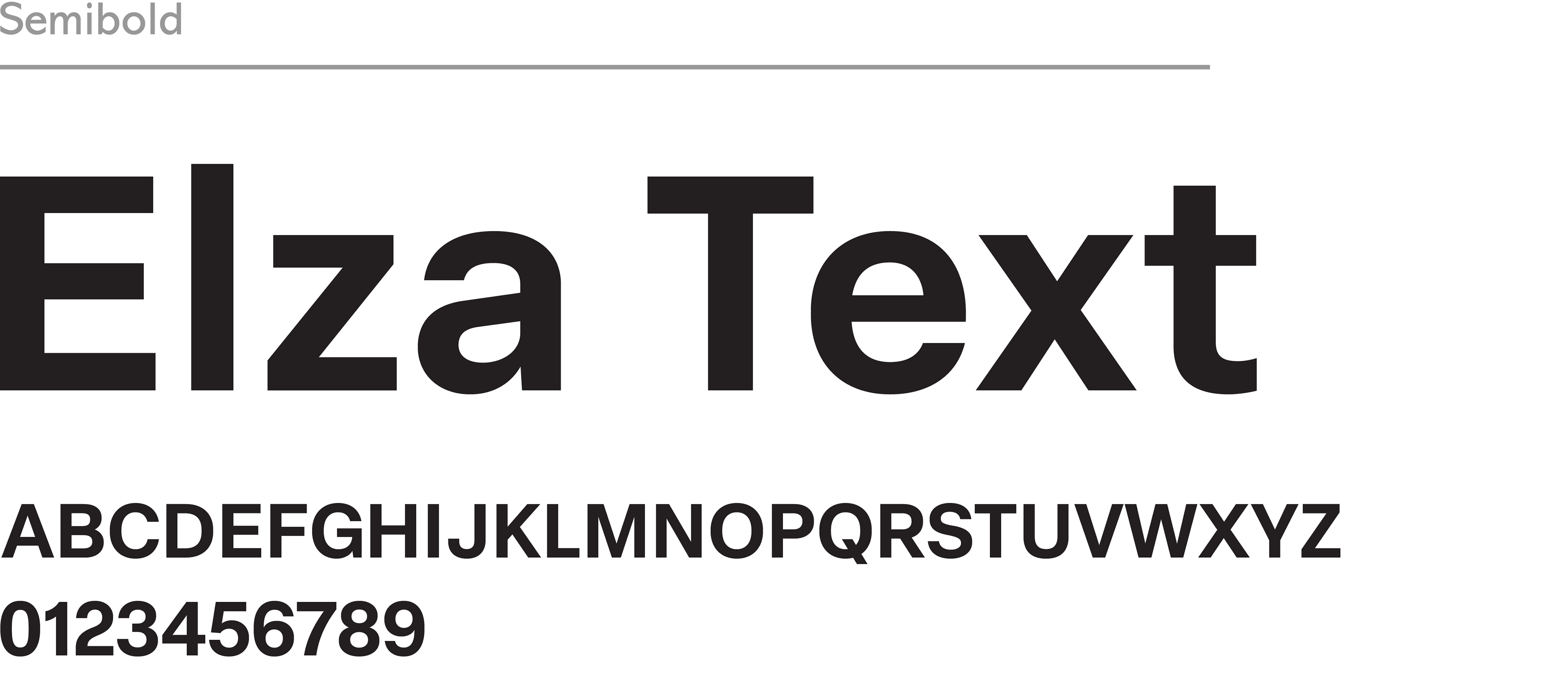
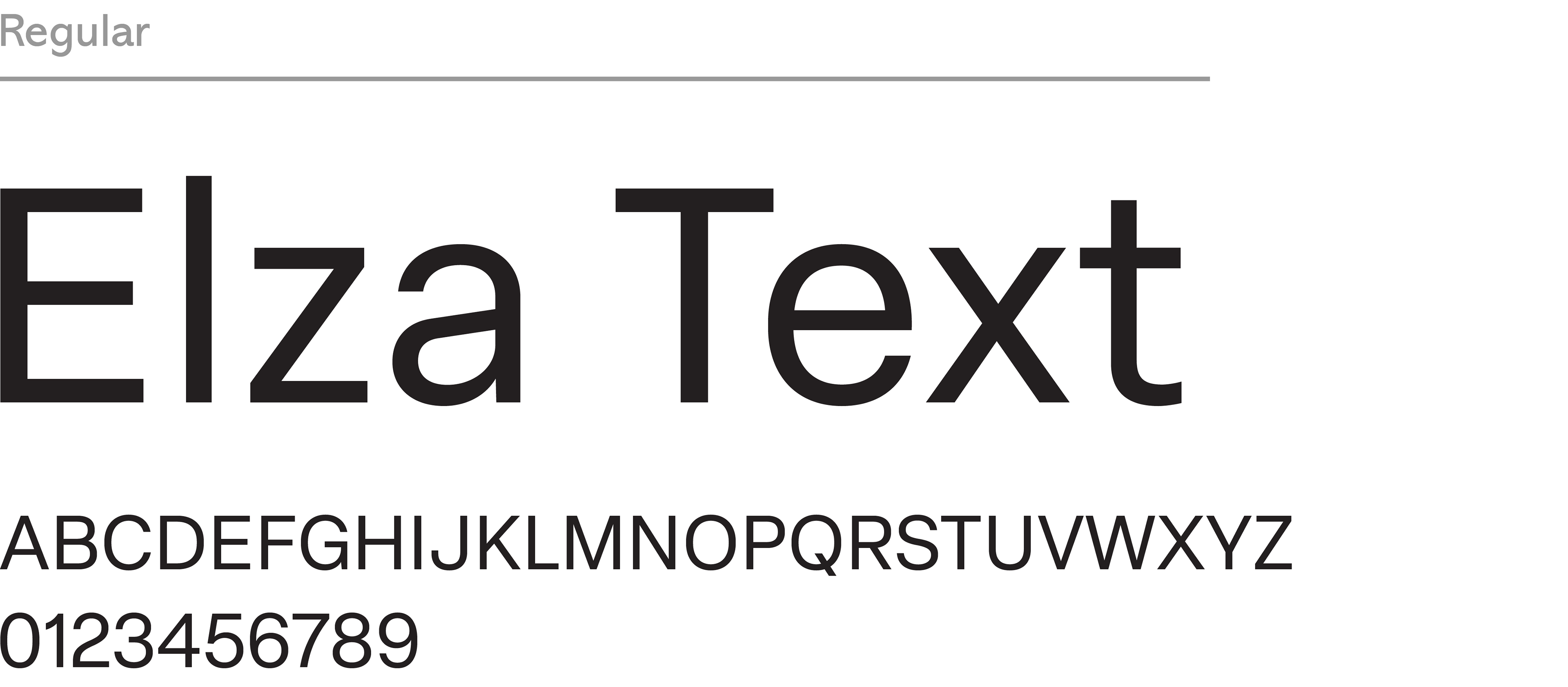
Elza Text is a sharp and clean sans-serif typeface. It isn't decorative and doesn't distract from the visual elements. Its features match those of the gazelle interpretation since the simplistic lettering resembles its long legs.

Composition Ideations.
Three different directions that experiment with text arrangement, different visual elements, and the gazelle's placement.
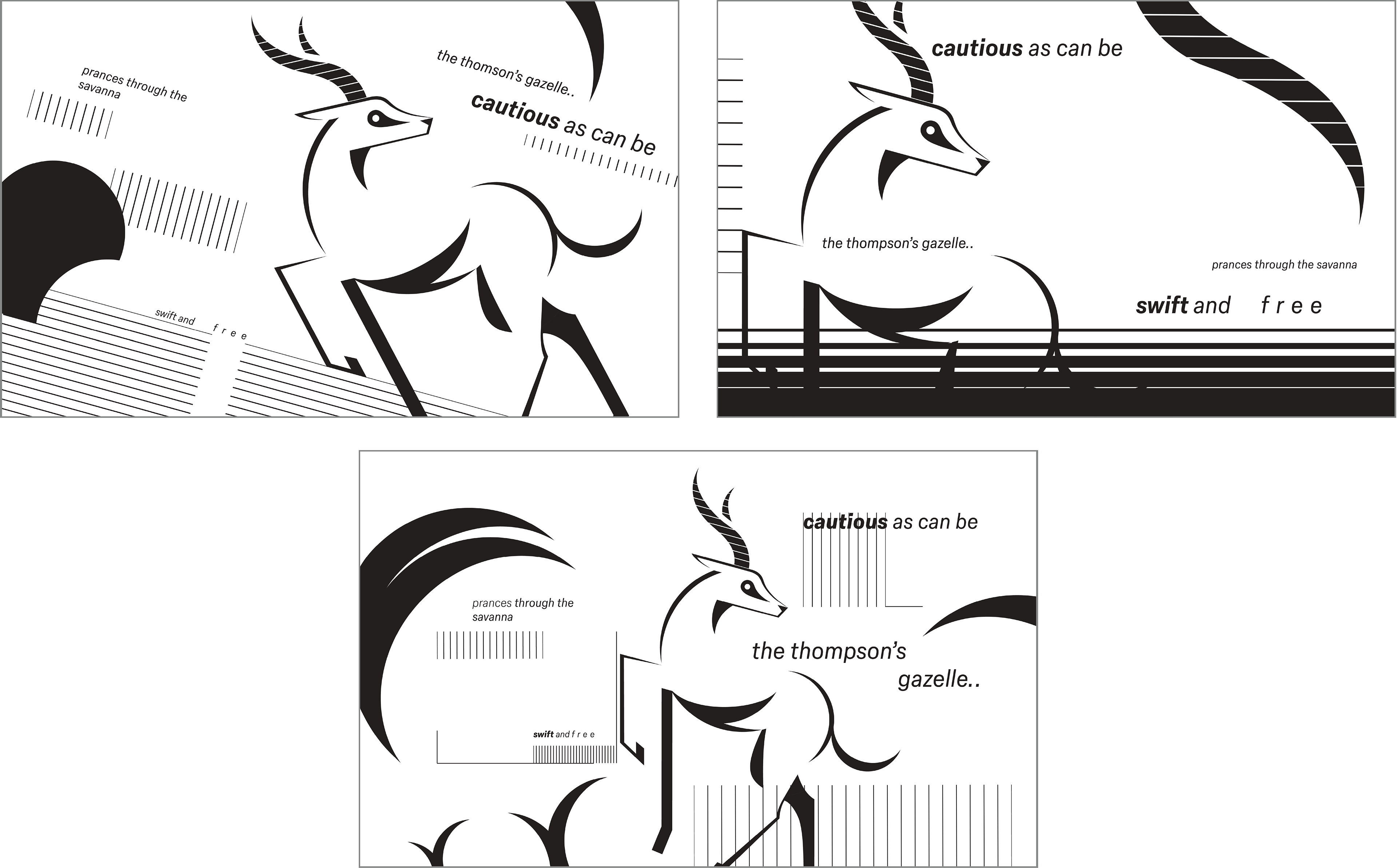

Refinement.
Out of all three directions, the first one is the most balanced. So it moved on to the refinement stage. The placement of elements is more intentional, and the text is spaced more evenly for easier readability.
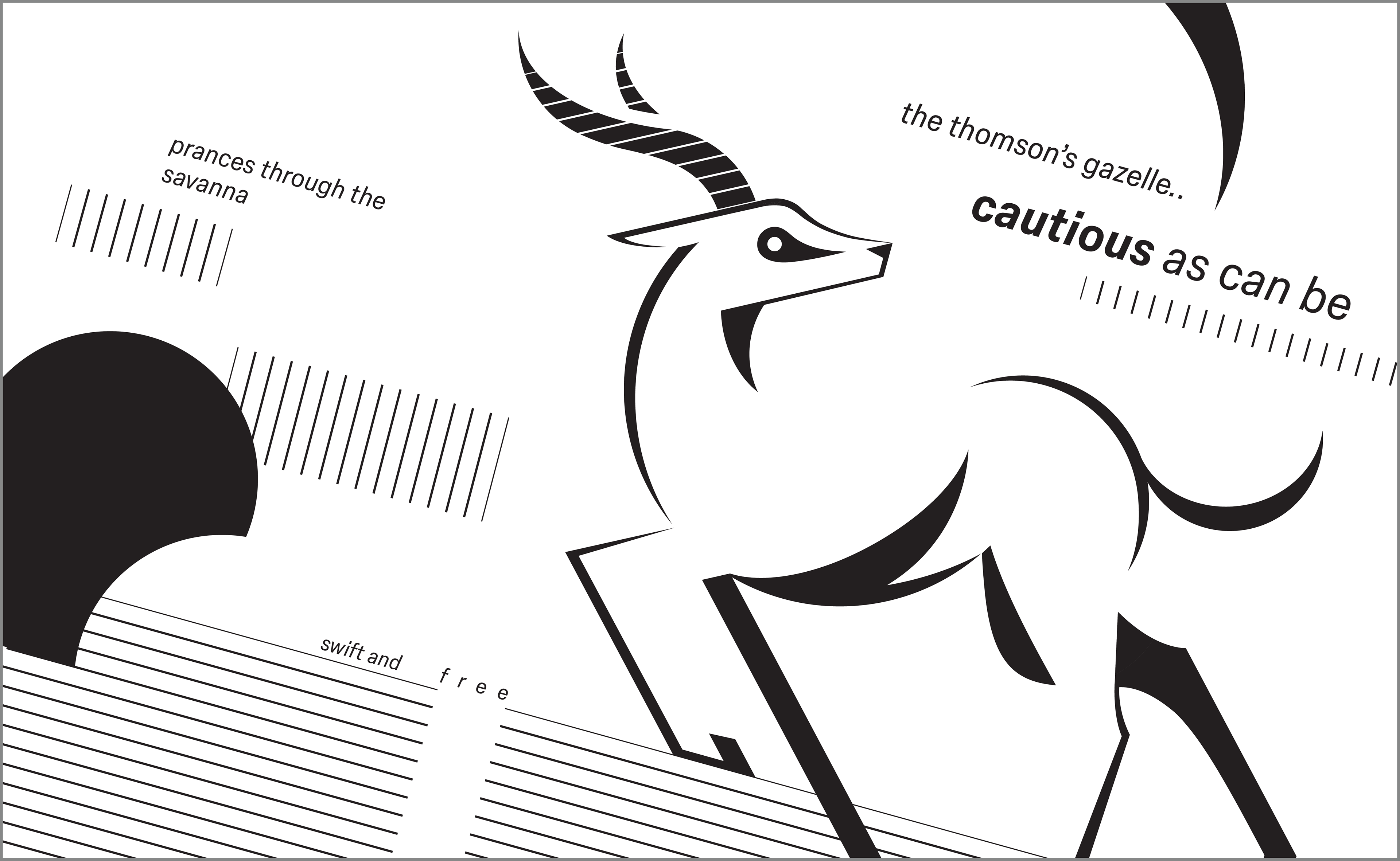
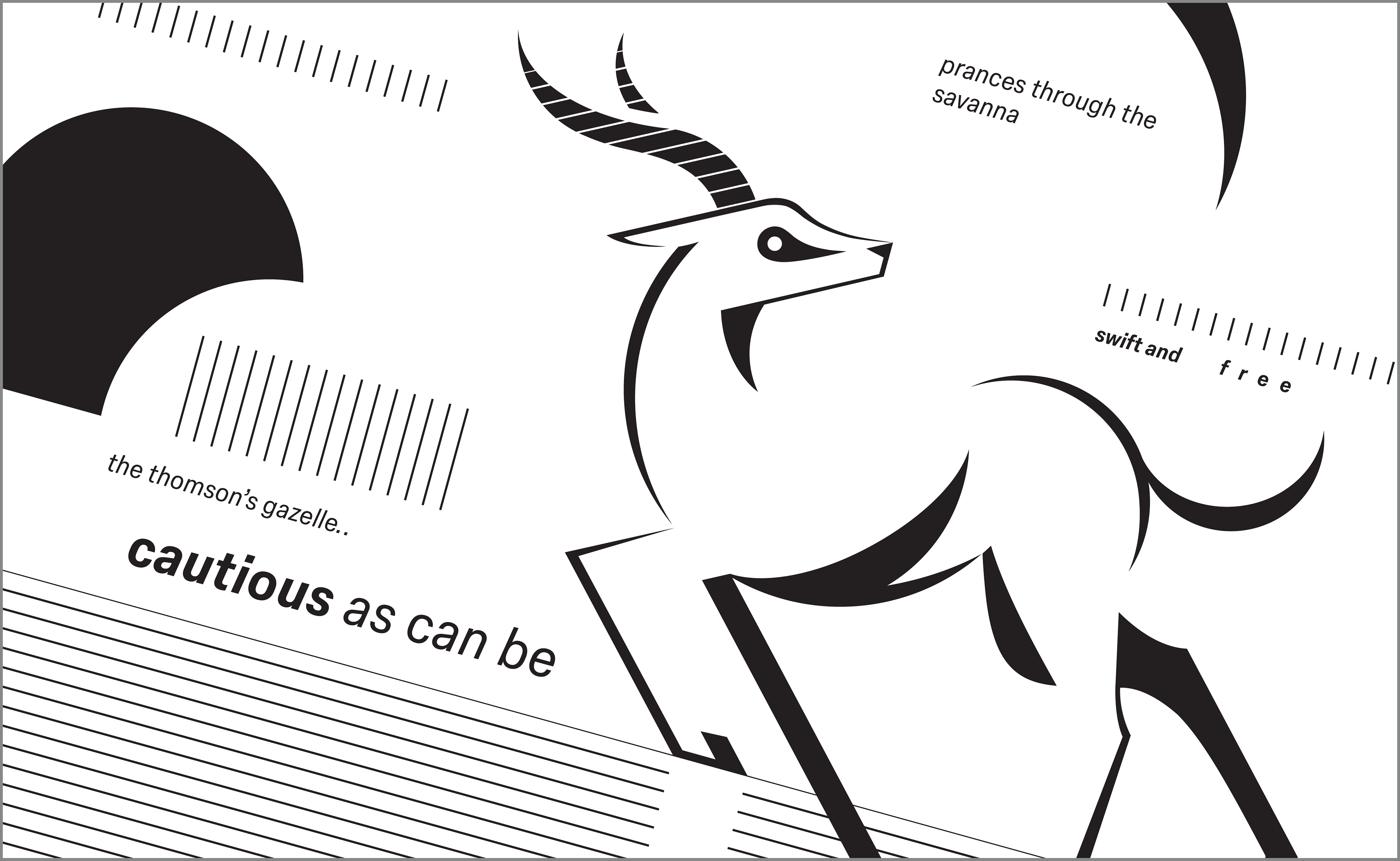

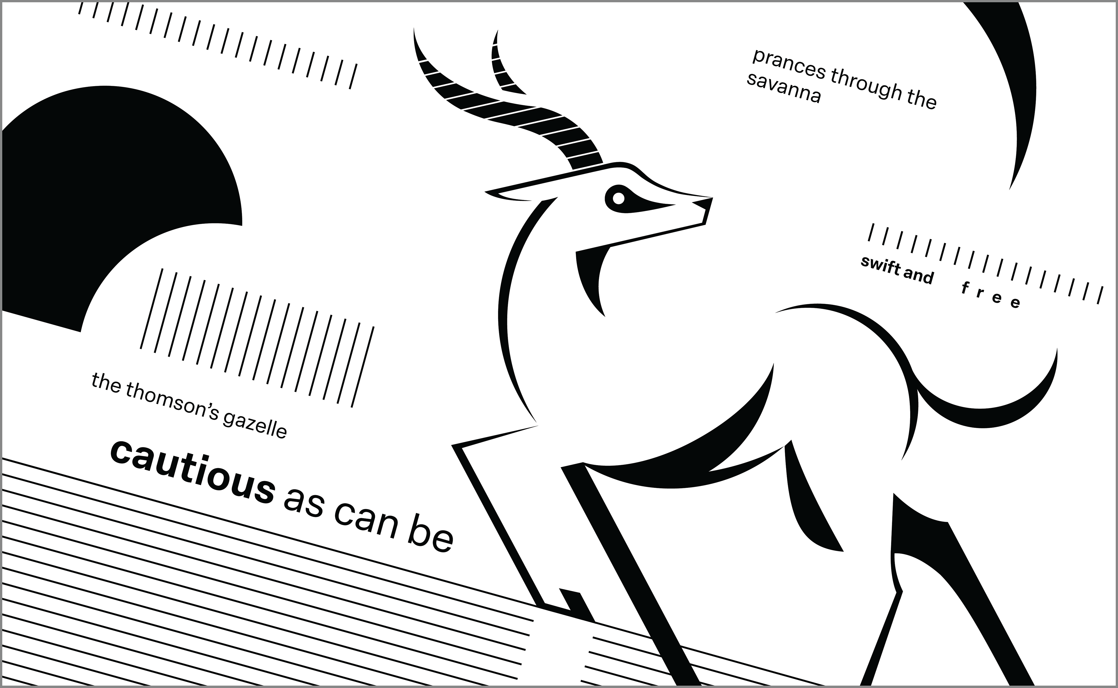
Black and White Composition.
This is the final black and white composition after slightly changing the alignment of a few elements. I also decided to use regular text instead of oblique to decrease tension.


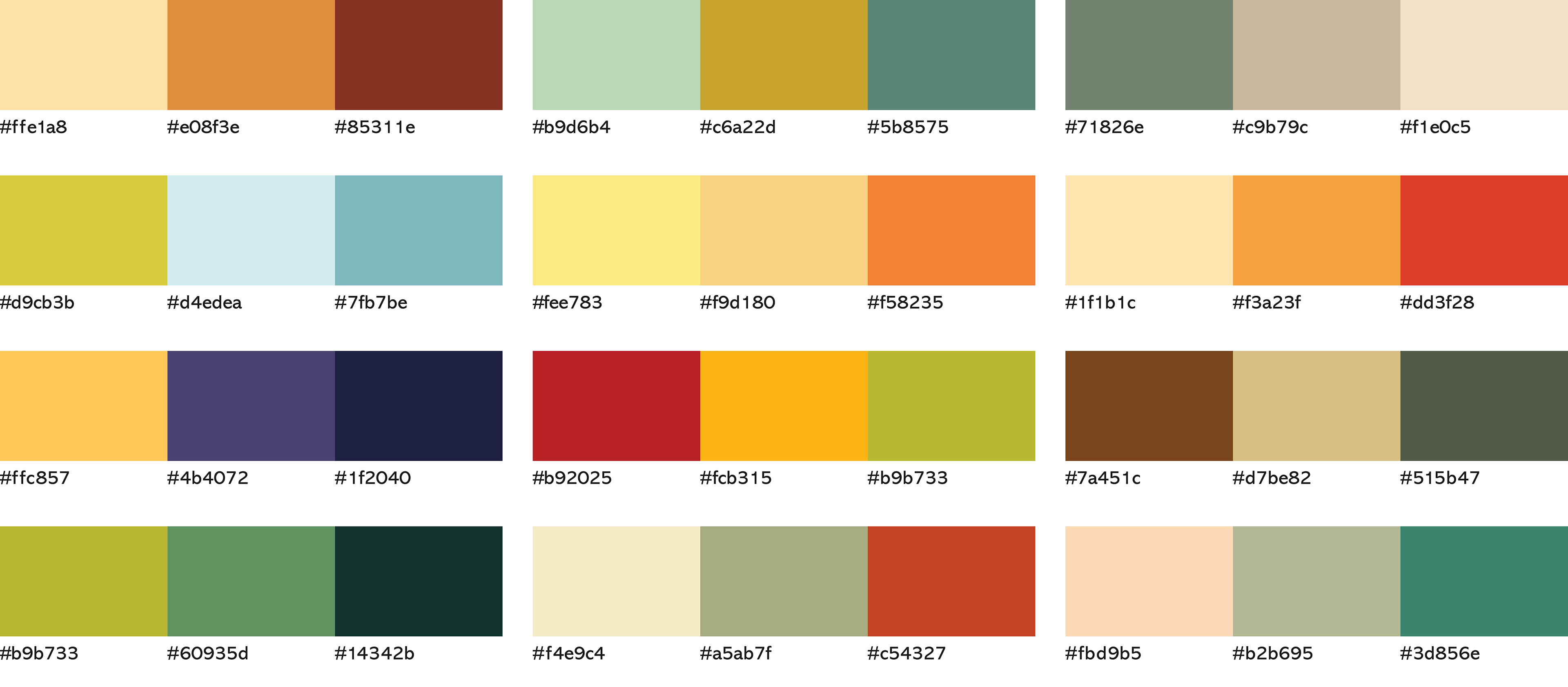
Color Experiments.
Created twelve different color palettes consisting of three colors each to explore in the composition.

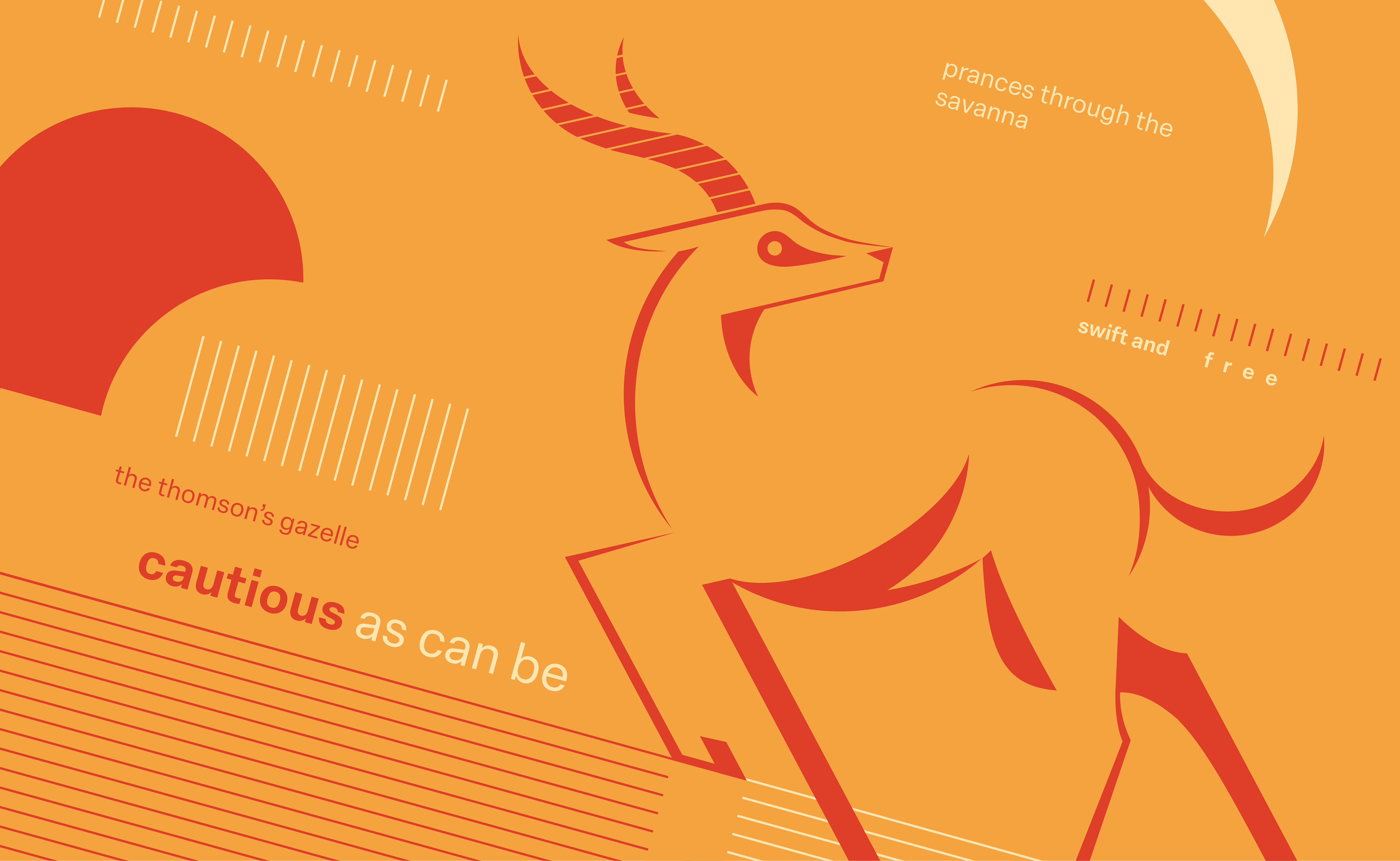
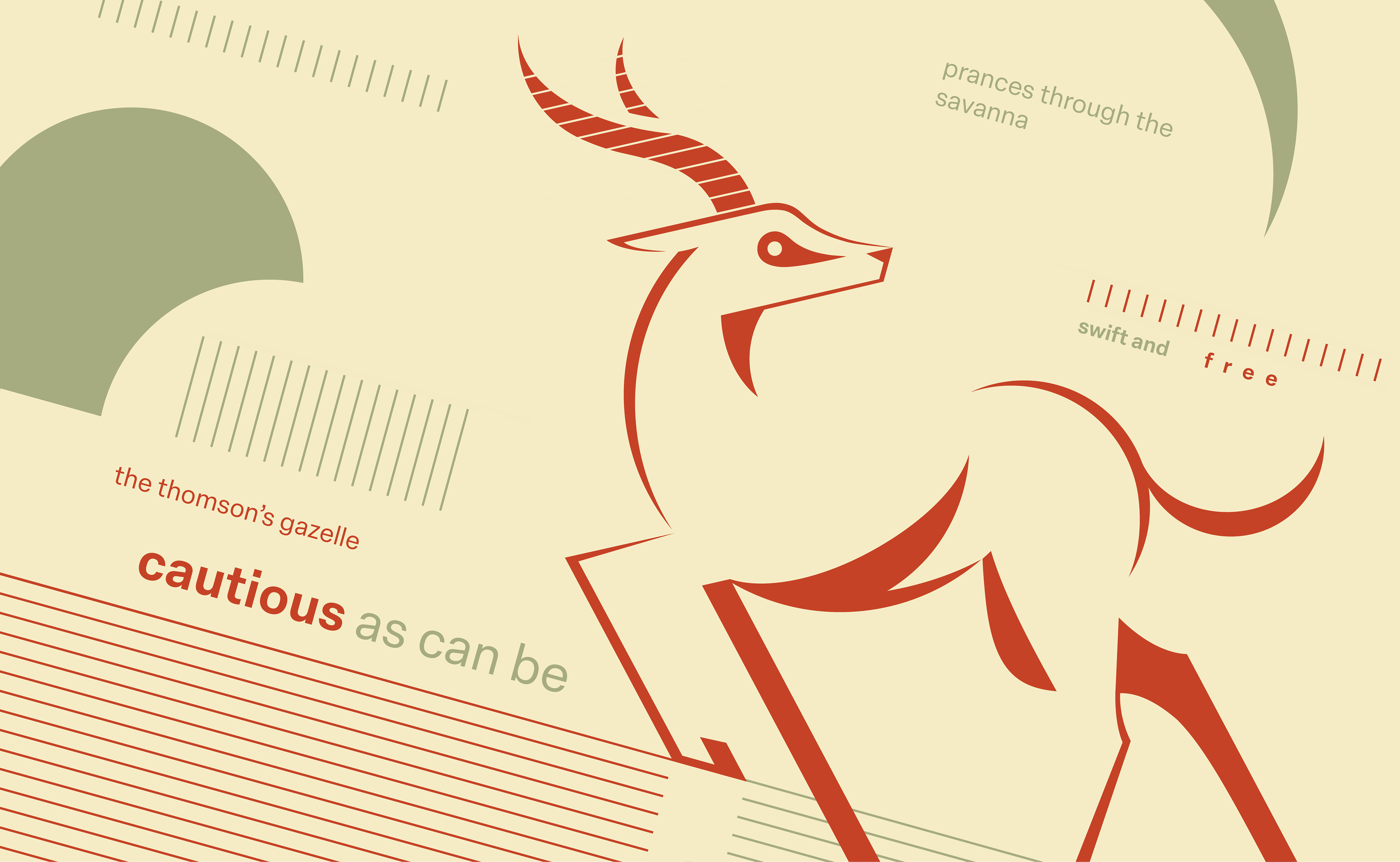
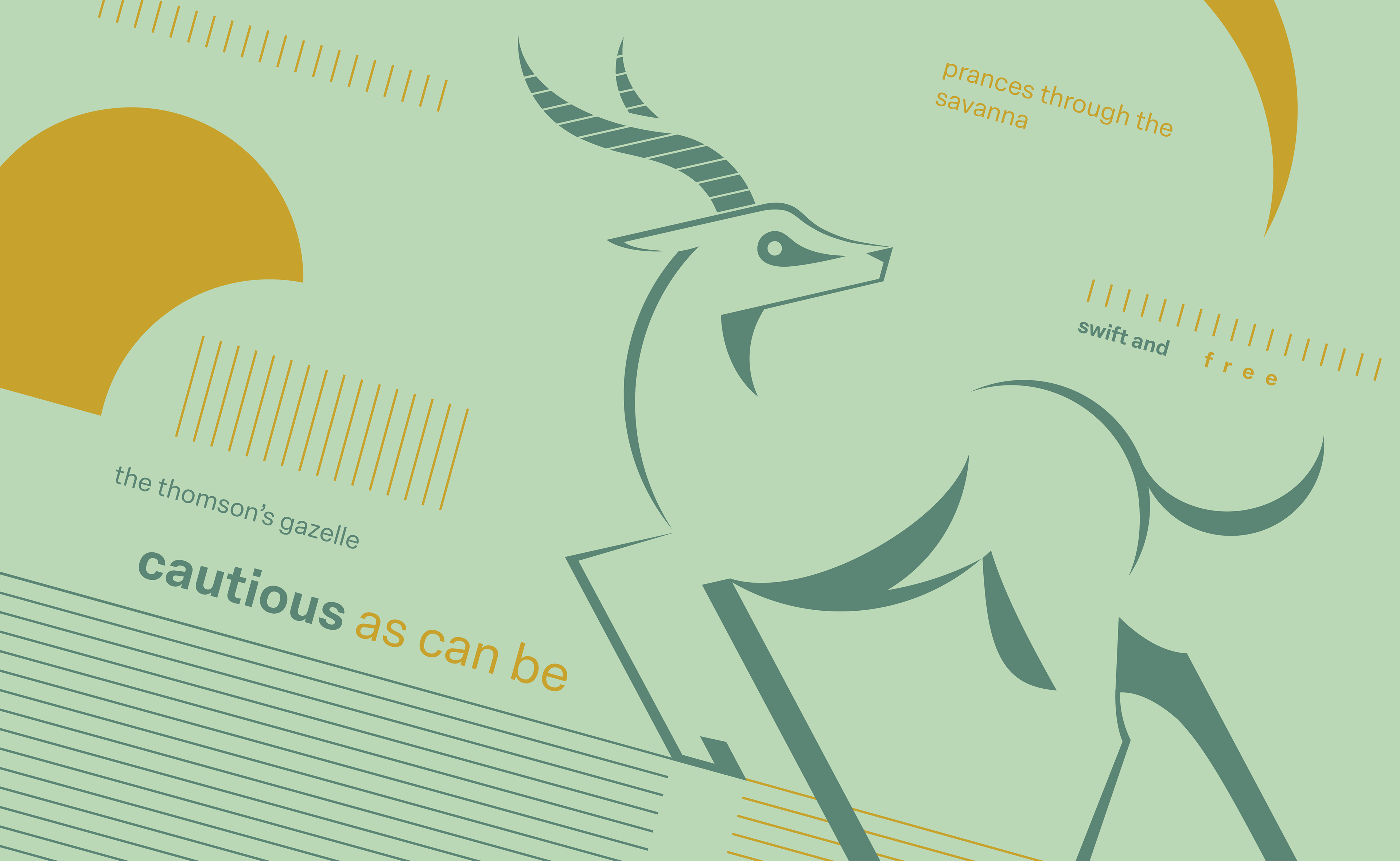
Applied Color.
I picked six of the most effective color palettes from above and applied them to the composition. I specifically chose ones that evoked a variety of different tones/moods. I utilized each palette to emphasize certain elements of the design in different ways.


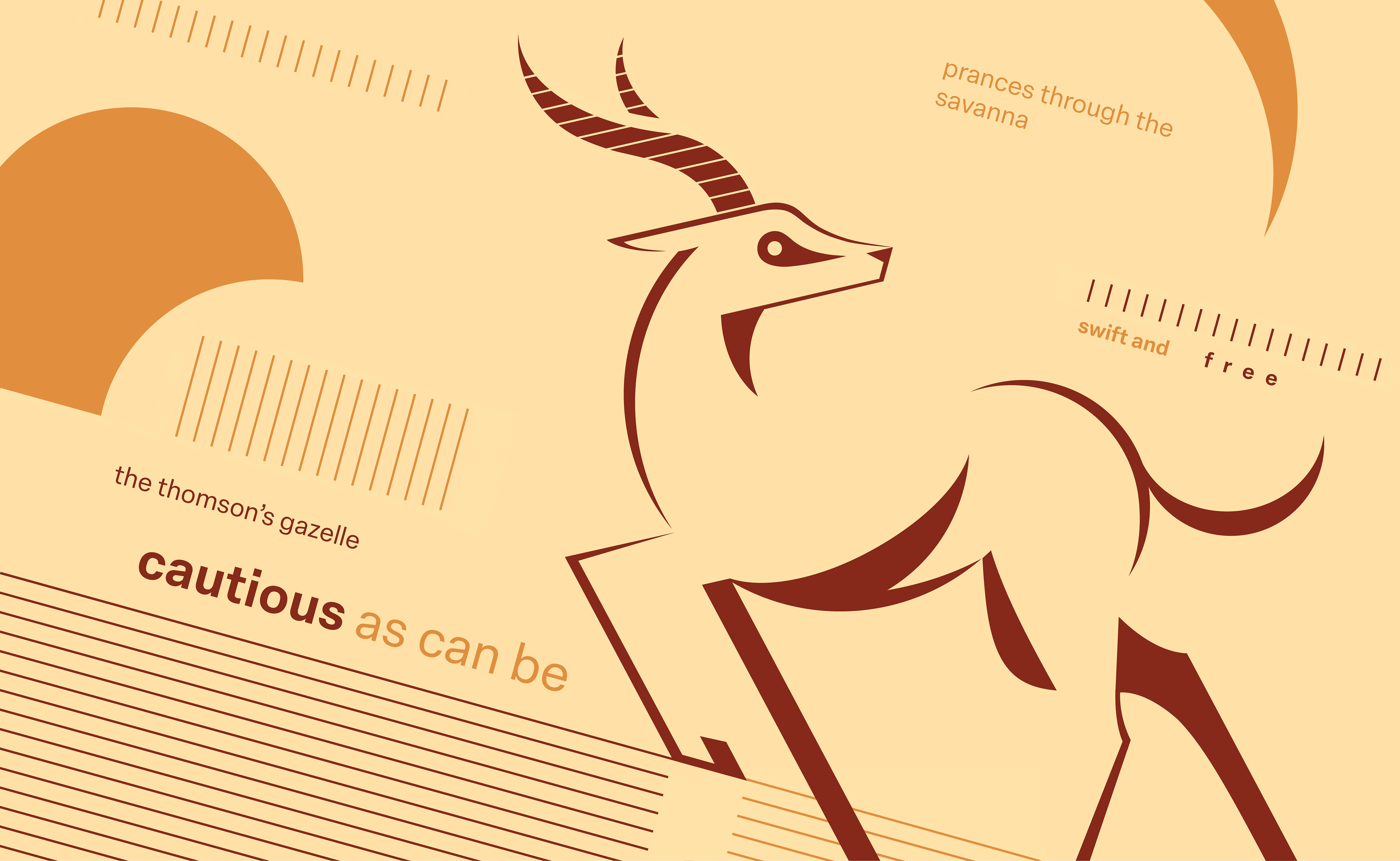
Final Color Composition.
To emphasize the hot and dry climate of a savanna, I decided on this warm analogous color scheme.